
Miselu
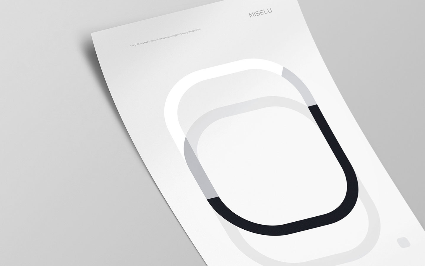
Brand identity, product typeface, and sustainable packaging designed for music hardware and software developer, Miselu. Miselu’s first product releases were the C.24–a two-octave iPad keyboard, and the T.10—a ten pad drum machine module.

Typeface
The product typeface required endless modularity to accommodate all current and future Miselu products. To achieve this, a custom, alphanumeric typeface was constructed on the principle that music is never static—a medium always in motion, with time serving as the canvas.


Packaging
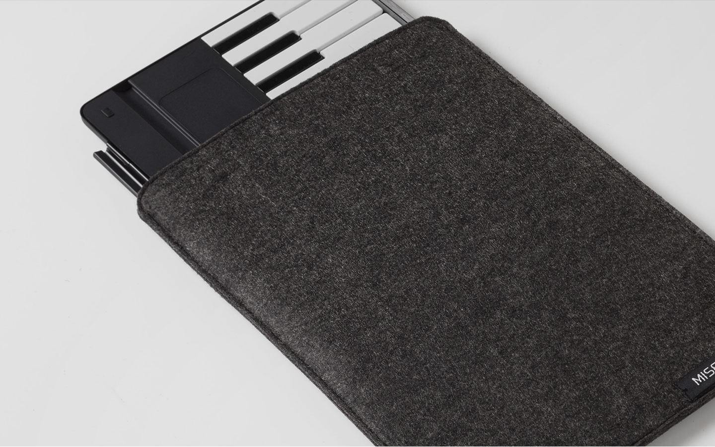
Frustrated with the excessive waste of standard packaging, the Miselu packaging system was intended to be sustainable. A temporary, biodegradable shell was used for in-store use—while the primary structure, a felt sleeve, operates as a reusable, travel pouch.


Credits
CD
AD
Design
Animation
Ben Pham
John Soat
John Soat, Yung Hung Huang
John Soat, Yung Hung Huang
Created at Character SF